The Pantone Colour Institute (PCI) has officially revealed the Pantone Colour of the Year 2023: PANTONE 18-1750 Viva Magenta.
An educational programme originally introduced by the PCI, the Pantone Colour of the Year has been in operation since 1999. It was formed to both engage and educate the world on the concept of colour, and highlight the relationship between colour and our global culture.
Why is Pantone Colour of the Year important?
Our culture is both reflected through and influenced by colour, and this is what Pantone Colour of the Year tries to explain. According to the PCI’s Vice President Laurie Pressman, the programme aims to help companies and consumers understand the power of colour, rather than simply promoting a particular one.
Speaking of companies and consumers the PCI want to target, Pressman says:
“We want to to teach them how to leverage colour’s power and expressiveness to influence perception – whether it be to create a more successful design strategy that will increase consumer engagement, or to use it to better showcase your own personal identity.”

The PCI is aware that for companies, a colour could be the deciding factor of a customer buying something or not. They also know that, for consumers, the impression they want to make through colour is a daily and conscious decision. The colours we choose to wear are sometimes affected by our mood, and the way we style ourselves is often based on a message we want to send to the world.
According to Laurie Pressman, colour has the power to say what words cannot. It's the first thing we see in something, and is a globally-inclusive language that helps us to express who we are as people. Therefore, its power knows no bounds.
How is the Pantone Colour of the Year decided?
So, who decides it what the Colour of the Year is? More so, how is the decision even made?
The Pantone Colour of the Year is influenced by anything and everything that’s taking place in our culture, and the global team of colour experts at the Pantone Colour Institute spend the year searching the world for new colour inspirations.
The PCI experts look at pretty much every aspect of our culture, such as:
- Entertainment
- Art
- Fashion
- Design
- Lifestyles
- Sporting events
- Technologies
- Materials and textures
- Gaming
- Social media platforms
- Socioeconomic conditions
- Travel destinations
Essentially, when it comes to colour, the experts at the PCI look at anything that captures worldwide attention. The colour must reflect what is happening in our global culture at that specific time, and must represent what the PCI sees for the upcoming year. Therefore, this doesn’t make choosing the Colour of the Year easy.
The selection process is completed over an extended period of time, and is achieved through analysing trends and an immense amount of consideration. The group of people at the PCI who decide the Colour of the Year have a unique way of seeing the world through colour, and choose one that reflects the world around them and what people need at that specific time.

Speaking of the decision making process, Laurie Pressman says:
“The Pantone Colour of the Year reflects what is taking place in our global culture at that moment in time. Then, we will drill down further to identify the exact shade, and as we did for the first time in our chosen colour for 2022 (PANTONE 17-3938 Very Peri), if we don’t have the exact colour to convey the message, we create it.”
The PCI also says that the name of the Pantone Colour of the Year should help tell its story. The Institute understands how names can bring up thoughts and feelings within people, and they always want to ensure that the name of the Pantone Colour of the Year can easily convey the message they are trying to send.
Why was this year’s Pantone Colour of the Year chosen?
The Pantone Colour of the Year 2023, PANTONE 18-1750 Viva Magenta, is an unorthodox shade to represent such an unusual time. It has a crimson red tone which balances between warm and cool and, according to Pantone’s website, is a hybrid colour that “comfortably straddles the physical and virtual in our multi-dimensional world”.
In short, as we work to find the balance between our physical and digital lives, our appreciation for the natural world increases – and the Pantone Colour of the Year 2023 acknowledges this. Viva Magenta represents how we are drawn towards natural colours as our world is dominated by sustainability and climate change.

According to PCI’s Executive Director Leatrice Eiseman, Viva Magenta is an inclusive, boundary-defying shade that thrives on joy, strength, optimism and self-expression. She says:
“In this age of technology, we look to draw inspiration from nature and what is real. PANTONE 18-1750 Viva Magenta descends from the red family, and is inspired by the red of cochineal, one of the most precious dyes belonging to the natural dye family as well as one of the strongest and brightest the world has known.
“Rooted in the primordial, PANTONE 18-1750 Viva Magenta reconnects us to original matter. Invoking the forces of nature, PANTONE 18-1750 Viva Magenta galvanizes our spirit, helping us to build our inner strength.”
Viva Magenta: Colour Psychology
According to Pantone, Viva Magenta is an even split between bold and fun. It stems from the red family (resembling power and rebellion), but also alludes to softness and compassion. Therefore, as the Colour of the Year 2023, Viva Magenta reflects a person’s desire to take on new challenges and provides the determination needed to complete them.
When deciding what the Pantone Colour of the Year 2023 should be, the PCI considered the last three years of disruptive events. Following the outbreak of a global pandemic and a war, as well as the worsening of climate change and the economy, we as a world must repair ourselves whilst also continuing to live on – and that’s what Viva Magenta represents.
How to Wear Viva Magenta

Science and global culture aside, it’s fairly common knowledge that wearing specific colours can evoke specific emotions and feelings for yourself and the people around you.
Viva Magenta is a powerful and versatile shade – so it can be worn as a statement or an accessory. It's also a vibrant red that’s not too warm, meaning it can be paired with a wide variety of other colours and shades.
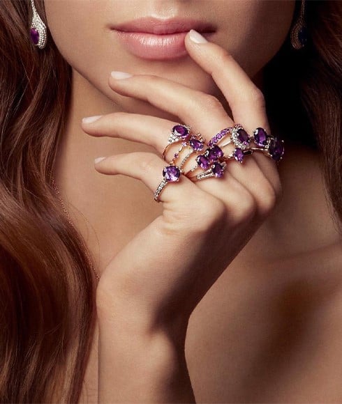
Viva Magenta and Jewellery
Although a shade like this is perfect for lipstick, nail polish and clothing, Viva Magenta (or a similar shade) is common among jewellery.
There are a huge array of gemstones that come in various shades of red and pink that emulate Pantone’s 2023 Colour of the Year, which can also be used to send its message of boldness, passion and determination.
Gemstones that embody this year’s Pantone Colour of the Year include, but aren’t limited to:
- Ruby
- Garnet
- Rubellite
- Burmese Spinel
- Purple Diamond
So, if you’re looking to take styling inspiration from 2023’s Pantone Colour of the Year, these gemstones are a good place to start.
SHOP RUBY
SHOP GARNET
SHOP RUBELLITE
SHOP BURMESE SPINEL
SHOP PURPLE DIAMOND
If you like what you see, our gemstone vault extends way beyond the above list: SHOP ALL GEMSTONE JEWELLERY